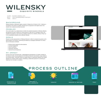
Client // Wilensky minerals, Nyc


Role // UX/UI Design/business strategist


Year // 2020-21

BACKGROUND

Wilensky Minerals is Mineral/Art gallery located in Chelsea the Art District of NYC. Wilensky is recognized in the industry as golden standard and is recognized as the highest level in the industry from collectors all across the world.

PROBLEM

The current state of our website does not reflect the esteemed reputation of Wilensky Minerals. Recognizing the need to elevate our online presence to align with our prestigious status, the president has tasked our team with the complete overhaul of our website, aiming to bring it up to the unparalleled standards set by Wilensky Minerals.

GOALS

Elevate the online representation of Wilensky Minerals to reflect its esteemed reputation as the gold standard in the industry, positioning the website as a prestigious destination for mineral and art enthusiasts worldwide.

  • Enhance brand image and online presence

  • Increase Engagement

  • Drive Conversions

  • Showcase collections

  • Improve the user experience

MY IMPACT

As part of the cross-functional team, I spearheaded the development of a holistic strategy for the website revamp, ensuring alignment with Wilensky Minerals' brand identity, target audience, and business goals. I iteratively refined our designs based on stakeholder feedback and insights gleaned from ongoing market research, facilitating a collaborative approach to achieving our objectives from concept to completion.

CURRENT STATE EVALUATION

To initiate the process, I conducted a thorough assessment of the existing product, scrutinizing the website layout and content to identify key areas for improvement. This evaluation aimed to distinguish between quick fixes and long-term solutions while uncovering the fundamental problems or needs addressed by our team. Some of the issues identified through our process.

RESEARCH

Present a clear brand image and message

Our visitors may struggle to understand the organization's mission, values, and offerings, hindering their ability to connect with the brand and engage with its content effectively.

Website is outdated
  • Website is unorganized

  • There’s no clear path as to what our clients should do when they arrive at the landing page.

  • Content appears unorganized and cluttered.

  • It looks like the website was put together just for the sake of having a website.

  • There news and updates on the website seem outdated. The most recent news should be ordered at the top of the page as most important.

Provide content “they” deem valuable

The content we share should be with the clients desires kept in mind. We have to eliminate useless information

Missed opportunity to give for engagement and informing
Our page looks as though we are a museum and showing off collections of special things rather that who we really are. We need to change our online image from strictly info based and incorporate better usage of pictures and luxury photography to give it more of an art/minimalist feel.
OVERVIEW
  • Current state evaluation

  • Customer interviews and analysis

  • Market Research

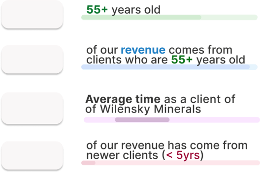
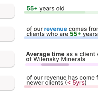
72%

96%

15

< 8%

years

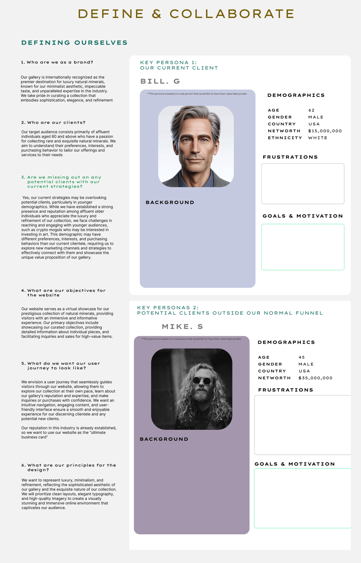
WHO ARE OUR CLIENTS?

INTERVIEWS AND FINDINGS

I participated with thorough 1-on-1 interviews with 16 of our clients to get a better understanding
of what we should be incorporating into the new website design.

Questions
  • What word come to mind when you think of when you think of Wilensky Minerals?

  • How often do you use our website for information?

  • Do you prefer to buy online or in person?

  • would buying online ever be an option for you?

  • What would you change about the current state of our website?

  • ( I like to ask this last to see if we have gathered an enough material to have an understanding about who they are as a customer/client. If we can predict this answer before we ask them, this is usually a good indicator we are have a high understanding of who our clients are, and what's important to them.)

Findings

When speaking to our clients they all had great things to say about the brand itself. The words or terms that got brought up frequently were, high End, best taste, and trust. However that was not the case when conversation about our website.

Key Terms

High End
Best Taste in Industry
Trustworthy

Website Usage

Our older clients surprisingly use our website frequently to see if there is any news or events coming up. Our younger clients suggest our website has little to benefit to them and they rarely use it.

We believe this is due to our lack of presence on our website. Modernizing our website may lead to our younger audience spreading the word through various social media outlets and increase the overall brand presence with the younger generation.

Buying Habits

Clients above 55 say they wouldn’t buy online. They prefer the face to face interaction.

Our younger clients suggest they’re not opposed to it, yet at our usual price point they probably would not feel comfortable without seeing the product in person

MARKET ANALYSIS

Meet Bill, a highly successful hedge fund manager with a passion for collecting the finest treasures the world has to offer. With boundless resources at his disposal, John seeks out our offerings not only for their unparalleled quality but also because he recognizes us as the sole purveyor of the absolute best in the world.

In addition to his professional achievements, John is a connoisseur of luxury and refinement, with a discerning eye for craftsmanship and artistry. He values exclusivity and seeks out unique pieces that reflect his exquisite taste and elevate his esteemed collection. With an appreciation for the finer things in life, John sees our offerings as more than mere acquisitions—they are cherished treasures that enrich his life and embody his appreciation for beauty and excellence.

Meet Mike, a highly accomplished cryptocurrency investor with a keen interest in diversifying his wealth through tangible assets. With a net worth of $50 million amassed from successful ventures in the crypto market, Mike is now exploring the world of collecting as a means of preserving and appreciating his wealth.

In addition to his financial acumen, Mike is a true connoisseur with a discerning eye for quality and rarity. He sees collecting not only as a sound investment strategy but also as a way to cultivate his passion for art, craftsmanship, and heritage. With his considerable resources and appreciation for the finer things in life, Mike is poised to curate a distinguished collection that reflects his unique taste and appreciation for timeless beauty.

  • The lack of trust in the industry

  • Dislikes wasting time unless he values the person he’s with.

  • Not being granted advantage over other collectors

  • Pricing

  • Lack of knowledge of news in the minerals world

  • The thrill of collecting

  • The ability to possess what no one can recreate

  • Being valued by those he deems high worth

  • Desires to have the best collection in the world

  • Passion for Art, and one of kind things

  • Love for Simple yet perfect things

  • Passion for learning more in the industry

  • Limited understanding of the art market and collecting process.

  • Difficulty finding trustworthy sources and authentic pieces.

  • Lack of guidance on investment potential and long-term value.

  • Overwhelmed by the vast array of options and choices in the collecting world.

  • Concerns about the security and storage of valuable assets.

  • Challenges in balancing personal taste with potential investment opportunities

  • Diversify investment portfolio and preserve wealth through tangible assets.

  • Cultivate a sense of appreciation for art, craftsmanship, and heritage.

  • Build a distinguished collection that reflects personal taste and values.

  • Connect with like-minded collectors and experts to expand knowledge and network.

  • Leave a legacy for future generations and contribute to cultural preservation.

  • Experience the thrill of discovery and acquisition while enhancing quality of life.
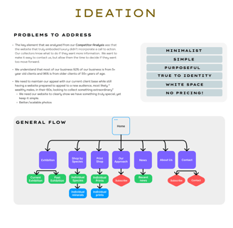
KEY POINTS TO ADDRESS:

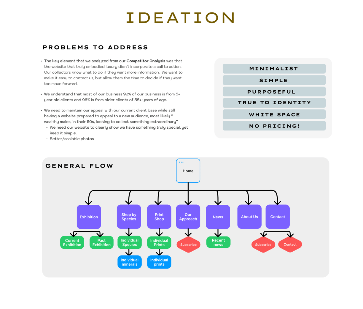
Luxury doesn't need to push a call to action. Our collectors know what they want and why they want it. The important steps for us will be making it easily assessable to reach us when they are ready to buy.

Power in curiosity. We can supply them will all the necessary information about the specimen itself, but we should allow them the room to wonder on the type of value of a particular specimen. Even if they reach out and don't buy, that is a wall we were able to break down for them, where we can make them feel comfortable about contacting us for any questions in the future.

92% of our business and 96% of our revenue is from clients who are 55 years or older in age

We need to maintain appeal with our current client base while still having a website that will appeal to a new audience, (most likely males in their 60s).

  • Keep it simple, and showcase what makes us special

  • Every photo on the website needs to be on brand and High quality
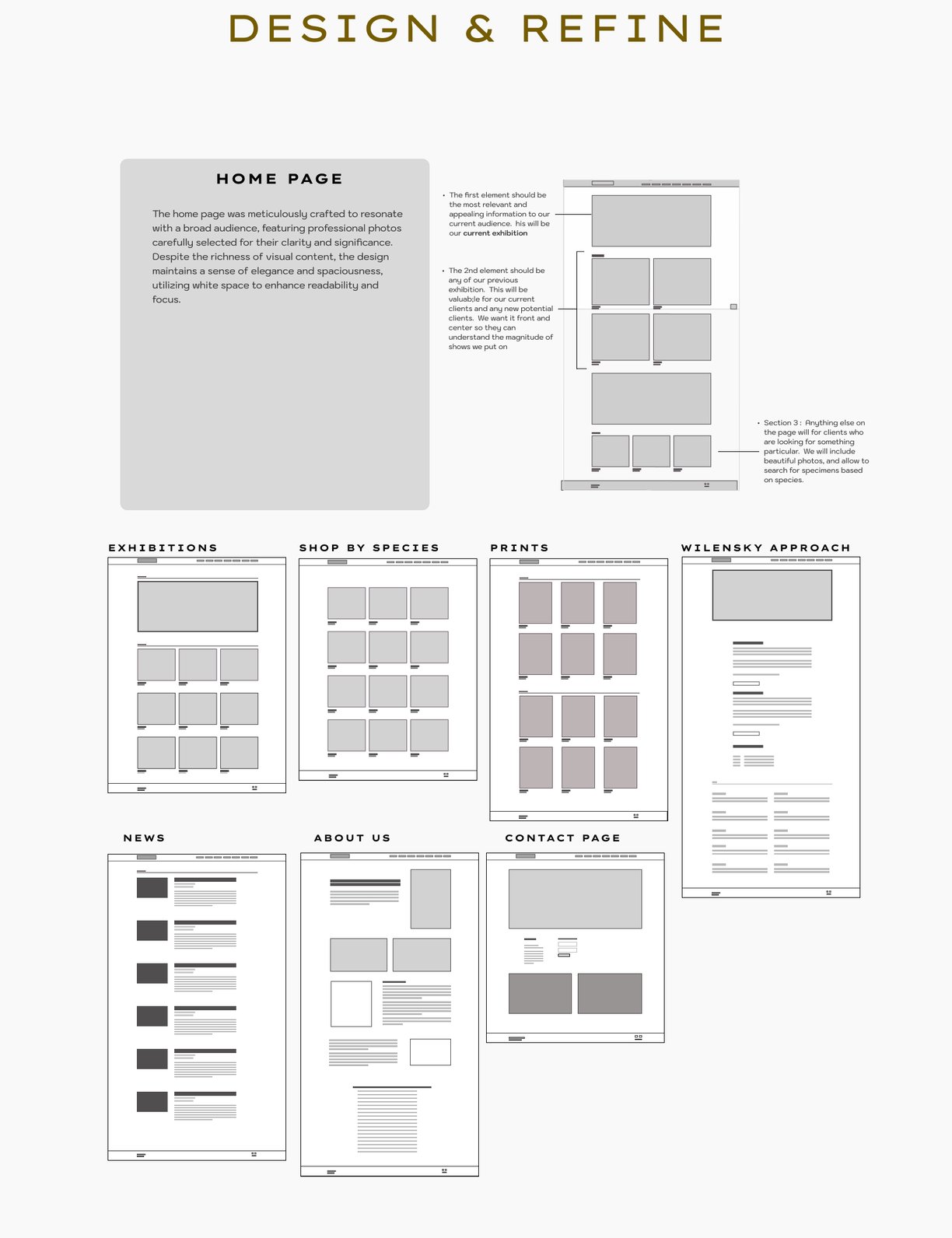
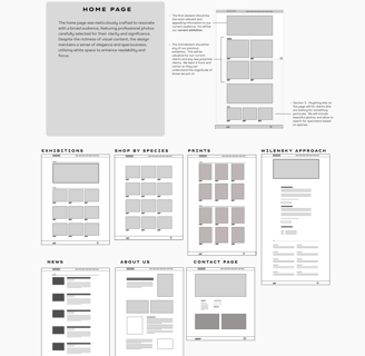
The first element should be the most relevant and appealing information to our current audience, while also acting as a catalyst to spark interest for any new visitors

The 2nd elements should be any of our previous exhibitions. This will be valuable for our current clients to see if they missed an exhibition, and will be valuable for any new clients to see. We want this front and center because it shows the magnitude of shows we put on, and we want that front and center.

Any other element will be in place for clients who know exactly what they are looking for. Whether they want to search for a particular specimen or search by a particular category.

Project Outcomes and Conclusion

Overview:

The web design revamp project aimed to enhance the online brand image and presence, create a well thought out hierarchy for the website, showcase recent exhibitions, and to enhance overall user experience of the Wilensky's website.

Achievements:

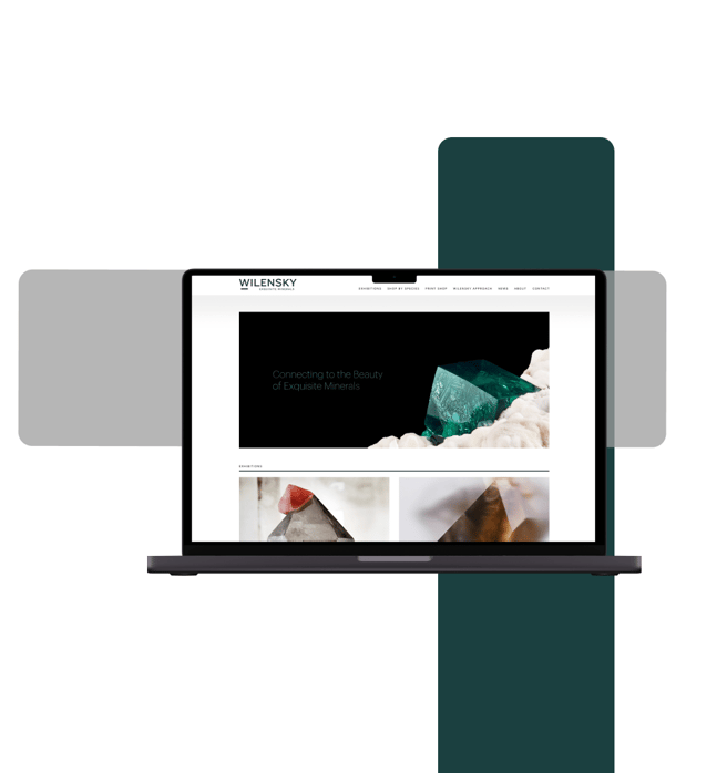
Successfully redesigned the website with a modern aesthetic that aligns with the gallery's brand identity and values.

Impact:

The revamped website led to a 40% increase in online art inquiries and more than a 300% boost in website traffic within the first three months post-launch.

Lessons Learned:

Despite my extensive design experience, this project was my first venture into UX design, providing a wealth of valuable lessons.

  • Prioritizing user feedback: Incorporating user feedback early in the design process proved crucial in meeting user expectations and improving overall satisfaction.

  • Hierarchy of Website Information: Establishing a clear hierarchy of information on the website, prioritizing prominent placement of featured specimens, upcoming exhibitions, greatly enhanced user navigation and engagement.

  • Minimalism is the backbone of Luxury: Understanding less is more in many instance for real world design helped us come to this finding, but understanding how to incorporate white space in the project change the entire feel of the project in a positive direction.

  • Consistency is Key: Maintaining consistency in design elements such as color schemes, typography, and navigation across the website helped reinforce the gallery's brand identity and improve user navigation.

  • Widen the search for design Inspiration: Expanding our design inspiration search was pivotal in our process. It underscored the significance of exploring beyond our usual expertise and industry boundaries, discovering valuable insights from leaders in unrelated fields. This approach helped us achieve a purposeful, functional, yet elegant and aesthetic website design.

Thank You for Reading.

I appreciate you taking the time to read our case study. Your support means a lot and I hope you found the information valuable.

Tell me what you think.

blue and white round illustration
Contact

tsullivan0414@gmail.com
845-239-1306